IMG_2075 (1)

Colorful Airport Shopping…

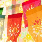
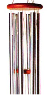
My flight back from Albuquerque was delayed so I found myself in the airport with spare time for shopping… I poked around in several stores and had to laugh as several of the items that attracted my eye…I already had hanging form my ceiling!

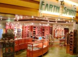
I wandered into Earth Spirit and was amazed by the selection of jewelry, ceramics, glass and wall hangings = not the usual things that one finds in an airport. In between the displays of art where hundreds of books on altered art, journaling, collage,creative inspiration and color…and to my amazement! and surprise  our book Polymer Clay Color inspirations.

I ended up buying some lovely New Mexico Pinon Coffee (chocolate cinnamon swirl) and yet, another book about color- as souvenirs of my wonderful trip to Albuquerque.

IMG_2075 (1)

“The Full Spectrum”

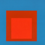
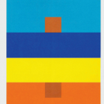
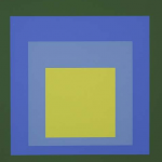
“Color is like cooking. The cook puts in more or less salt, that’s the difference! (Josef Albers)”

Dwell Magazine has a new series of videos on Vimeo –“The Full Spectrum” -Part one directed by Gary Nadeau features a visit to the Albers Foundation in Connecticut. ‘He was constantly trying new things,compared himself to a chef in the kitchen trying new recipes to see what works. He tried to record the recipes very precisely”- (often on the back of his paintings).

My first semester of college in addition to Design 101 we were all required to take Color 101 (which was based on Albers book The Interaction of Color. I still remember the field trip our class took  to the university library to view a folio of Alber’s silkscreens. We  all had to don white cotton gloves and were allowed to handle the pages and look at the prints close up in the sunlight.


IMG_2075 (1)

Colorful Gradation…

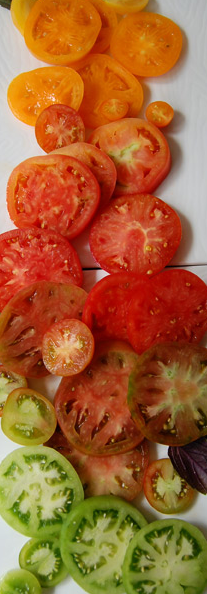
Usually when I arrange a heirloom tomato and mozzarella salad I  alternate the slices… after being inspired by Design Sponge Online, I will be re-evaluating just how I arrange my slices and plan future Skinner blends in polymer.

There are several inspirational examples of late summer color gradations in addition to instructions for making a colorful flower garland included in their latest posts.

I’m off to Albuquerque in the morning to teach a color workshop and to drink in the wonderful colors of the southwest!

Thanks to Cynthia Tinapple for sending me this link.

.

IMG_2075 (1)

Value Is Key…

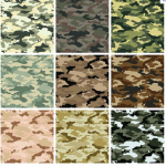
There is a series of interesting posts about color on Mark Kennedy’s blog- Temple of Seven Golden Camels =”an online repository for everything I know about story boarding, film making,drawing and animation.”  The two most recent posts help to explain through a series of illustrations the concept that “color is value.”

“Using tones carelessly can get you into trouble. Using spots of tone that are unrelated to each other can result in confusion, much like the concept behind camouflage.”

IMG_2075 (1)

Skinner Blend Preview…

One way to “preview” how a Skinner Blend between two colors will look, before committing to  to a larger quantity of clay, is to make a small sample. Using two postage stamp sized pieces of clay- cut and divided on the diagonal into triangle shaped pieces and then mixed on an ultra thin setting on your pasta machine..

Another way is to preview it online by using the color mixing  feature found at 3schools.com. By clicking the “Mix” link next to each color name, you can experiment with making a blend between two colors.

I found it particularly interesting to experiment with blending darker colors to different variations of the very light valued colors. In anticipation of using a tinted white in a Skinner blend, for example, try a  green to a very light orange.

IMG_2075 (1)

Colourful Journey in Nepal…

It is exciting to imagine that the readership of our book Polymer Clay Color Inspirations has extended to Nepal and is offering inspiration to a group of artists there. You can read more about it on their blog here or find out how to support the project …

A Colourful Journey is the online store for Nepali women who have survived domestic violence and are developing ways to generate an income for themselves and their families.

IMG_2075 (1)

Colorful Inspiration

Martha Aleo- Ornamento- from Philadelphia has been blogging about her results of following along with the exercises in our book, Polymer Clay Color Inspirations.

It is thrilling to see her becoming more confident about making color choices in her work.

IMG_2075 (1)

Stop the Glop!…

One of the most frequently asked question on the polymer clay message boards is “How do I seal my polymer clay pieces?” Except for a few instances, for example: protecting the surface of a photo transfer or ensuring that a mica powder that has been applied to the surface doesn’t abrade there is absolutely no reason to apply a sealant to the surface of the clay.

I would imagine that you wouldn’t consider putting five coats of spar boat deck varnish onto an antique rosewood table…so why would you even consider putting Flecto Varathane or Future Floor polish onto your polymer clay creations? No matter how many coats that are applied, polymer clay will never look like glass- not to mention the propensity of these varnishes to glop, drip, bubble and drool! I’ve yet to see a piece that I felt was enhanced by the use of one of these varnishes and sometimes the glare makes it nearly impossible to see the beauty of the underlying surface.

When a piece of polymer clay jewelry has been worn a number of times it begins to develop a lovely patina from the body oils of the wearer. Other alternatives are to sand and buff your pieces to a high gloss, apply a light coat of Golden Acrylic Matt UV protectant or a light coat of archival wax (such as the Renaissance Wax book restorers use).

IMG_2075 (1)

Colour Lovers highlights the book

I am delighted to see our new book – Polymer Clay Color Inspirations- included in the “Eclectic Color Roundup” on the Colour Lovers blog.

Colour Lovers is a very interesting and dynamic site, Color + Design Community for Creative Inspiration (last count 259,353 members) and includes forums, patterns, palettes, trends, a blog and a store.

One of the recent posts that I particularily enjoyed was on the Colors of Frida Kahlo.