IMG_2075 (1)

Colorful Inspiration…

As artists most of us have “go to” books and artists where we look to for color inspiration. Kaffe Fassett is one of my favorites for color and pattern. I have six of his books, my favorite is Glorious color.

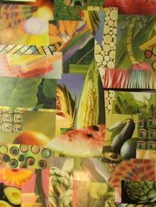
Several of his fabrics play important rolls in my patchwork living room curtains and over the years I have made several color inspiration collages based on clippings from an old Kaffe  Fassett calendar and photo copies of fabric swatches.

After reading his mosaic book- I made a colorful side table. So, I am thrilled that he has a new book out – “Simple Shapes Spectacular Quilts”. There is an interesting video interview here where he starts by saying “What interests me more than anything in the world is pattern”.
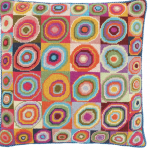
I wonder just what he would do if he experimented with polymer? For more inspiration visit his student’s Flickr pool.

Continue reading “Colorful Inspiration…”

IMG_2075 (1)

Update on Cobalt Blue and Zinc Yellow…

Thank you to everyone who took the time to write to the company, post on their Facebook page and spread the news…

Here’s the latest statement we have just posted on Facebook today, 11/22/10.

“Polyform has reviewed all of your heartfelt comments in reference to Premo Cobalt Blue and Premo Zinc Yellow. In response to your needs we are going to find a way to keep these colors available for you. We will work with distributors and will post the information as soon as we finalize it.

To answer some of your other concerns:

  • Frost has been renamed White Translucent in order to clarify it’s color to new users. The color has not changed.
  • Copper has changed, there will be a color recipe to create the older version of this color. The new Copper color is closer to the color of a new copper penny.
  • The fluorescent colors have been discontinued. Two new colors, Wasabi and Candy Pink are quite bright and sure to make a “color pop” in your creations.
  • The recipes for discontinued colors, with the exception of the fluorescent colors, will be available. Many of the recipes use new colors so releasing the formulas now will not help you. We’ll release the formulas on January 3rd when the new colors are going to be available to ship.

We are really excited about our new line of Premo Accents, Premo and Sculpey III, as we’re sure you will be. Designers who have already used these colors are singing their praises. They’re on trend, as well as colors designers have requested.

Your comments were heard, your loyalty appreciated.

If there is anything else I can help you with, please contact me again. ”

Continue reading “Update on Cobalt Blue and Zinc Yellow…”

IMG_2075 (1)

Not so Colorful Changes…

Life is always full of surprises and challenges…Earlier this fall I received the news that Polyform Products was planning on making changes to their Premo! polymer clay color line. While I imagined that it might be possible that a few of the colors that I currently use might be discontinued- perhaps the fluorescent yellow wasn’t a huge seller?- I wasn’t prepared for the extremely upsetting news  that they are  planning to stop making two very essential primary colors = Cobalt Blue and Zinc Yellow!

“The following colors are discontinued: Red Pearl, Green Pearl, Cobalt Blue, Sea Green, Copper, Zinc Yellow, Frost, Fluorescent Green, Fluorescent Yellow, Fluorescent Red and Glow-In-The-Dark – We’ll have recipes for most on our website.”

It will be interesting to see their recipes for mixing zinc yellow and cobalt blue.

  • You can follow the discussion about this announcement on Polyform’s Facebook page here.
  • Carol Simmons has posted “before and after” pictures here
  • Cindy Leitz has started a virtual online petition here
  • Crafty Goat has posted some of her reactions on her blog
  • Amy Crawley has posted here on Moon Room Musings
  • Crafts by Chris has joined into the discussion
  • more here at Tonja’s Treasures
  • there is an ongoing discussion on Polymer Clay Central here
  • here is the contact email for Polyform Products- info@polyformproducts.com

I’m off to take a long warm bubble bath in honor of my personal promise to myself NOT to write blog posts, respond to email and/or answer the phone when…

In the meantime, please enjoy this picture of  Carol Simmon’s pendants- you might have guessed it! =  colors mixed with Zinc Yellow and Cobalt blue .

Continue reading “Not so Colorful Changes…”

IMG_2075 (1)

Colorful Paint Sound Sculptures..

Libby Mills sent me this colorful link to Design Bloom where you can see these wonderful sound sculptures.

“the creative Studio Dentsu, teamed up with photographer Linden Gledhill to create this series of paint sculptures using sound vibrations. the series was part of a campaign for Canon’s Pixma ink printer brand. the photographs and videos begin by wrapping a membrane around a small speaker. ink drops were placed on this membrane and the speaker was turned on. once it began to vibrate the ink begins to jump up and down. high-speed video cameras and still cameras were used to capture this including circling around the sculptures to see them from all angles. experimenting with different sounds and frequencies created the various pieces.”

Wishing you a colorful weekend and smooth transition to non-daylight savings time. I’m off to teach a color workshop in Dallas, Texas.

IMG_2075 (1)

Colorful Pivot Beads…

I have many fond memories of the beginning years of the National Polymer Clay Guild. We would gather around dining room tables to hold our board meetings- which very often wouldn’t start on time because many of us had eagerly brought show and tell items to share. Sometimes these were new tools, but most often the were pieces of work made by ourselves and others. We were thrilled to see Lynn Swards early photo transfer pieces, Pat Berlin’s rolled rug beads and Kathleen Amt’s complex cane collage beads.

I would venture that none us imagined that twenty years later we would be able to view and share pictures of the work of others via Flickr, blogs and web sites!

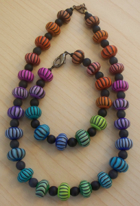
In chapter three of our book- Polymer Clay Color InspirationsMaggie Maggio designed the lovely pivot bead necklace as the chapter’s project. I was the lucky recipient of her purple version of the Pivot Bead necklace.

Recently, I spotted these two adaptations of the project on the web. Above is a glass and pivot bead bracelet by Svenja and below is a set of necklaces made by Janette Waters.

Pivot beads Inspired by Maggie Maggio
IMG_2075 (1)

Colorful Rhubarb Red…

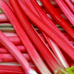
I’ve been reading about the new red celery with fascination – (not really red to me, more like the “red” of red onions) …somewhat surprised to have landed on a site that explains “value added produce” (while following the  link trail) which is  something apparently that I buy often .

I am dreaming of rhubarb as I embark on making a new series of folded petal necklaces.

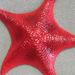
Colorscape- an Around the World Guide to Color by Naomi Kuno and the Color Intelligence Institute calls this red “Starfish”

  • Tropical
  • Floral
  • Gaudy
  • Charming
  • Alluring

CO/M98/Y75/K0

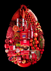
I drew color inspiration from food stylist Linda Lundgren’s food arranged by color series.

To mix my variation of this color I used one part Premo Cadmium red and one part Premo Fluorescent Pink. The resulting red is vibrant and makes for an edible looking cane which I look forward to fashioning into part of my new series of necklaces.

Next time you set out to mix a vibrant color in polymer clay  consider using either a fluorescent yellow or pink to pump-up your mixes.

IMG_2075 (1)

Colorful Teaching…

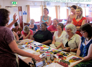
I love teaching– especially polymer clay workshops that allow the students  to come to a new understanding of color = how relax into approaching color with intuition; mix new colors, design palettes and learn new strategies for combining colors successfully. Above  is a picture of me teaching this past summer at  Polymer Play Days (sponsored by Helen Cox) In Nottingham, England.

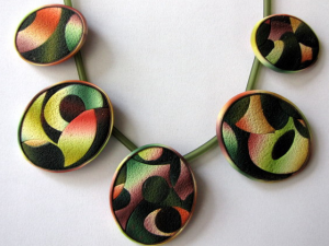
It is especially wonderful to see a student take inspiration from a class to make  a wonderful personalized variation on a technique via a finished piece.Here is a necklace from Ghost Shift/Sue Corrie.

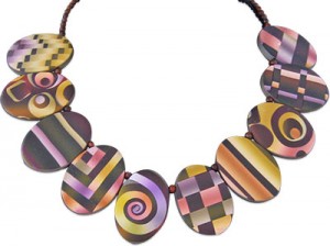
After teaching Textile Inspirations in Albequeque last month, Janet Paul sent me a picture of a delightful sampler necklace she made.

IMG_2075 (1)

Colorful Organization…

For the past year, with the help of an enthusiastic, patient friend I have been de-cluttering and organizing in bi-monthly four hour chunks. Last week we went through twenty years of accumulated jewelry findings –

what a “surprise” to find a stash of several hundred head pins!, fifty badge holders (what was I thinking?) and what a “relief” to pass-on to another artist a clasp I no longer use (because covering it with polymer clay was in the beyond tedious category for me).

I am finding myself gravitating towards brighter and more cheerful colors- via curtains, new rugs and wall hangings.There are dozens of colorful accessories at See Jane Work and helpful posts on their blog.

IMG_2075 (1)

Color Inspirations…

Jack Brenfoerder is a Design Director at Landor Associates who specializes in color strategy, trends and forecasting. In a recent blog post he discussed creating your own color inspiration book.

“Think of using colors like spices and the final color combination as the delicious dish. Using this principle, I have created a simple way that anyone can generate color combinations and palettes that are more natural, intuitive, and emotionally based. Rather than just starting with individual colors that you like and using your own color sense to create a final color combination, how about collecting color recipes in advance to create your own color cook book?”

What I found most interesting was his description of taking three color inspirations (in the illustration he used three photographs) – two that “contrast” and one that “harmonizes” and identifying the most important bridge colors between the images and the accent (spice) colors.

Forty of his favorite color inspirations (along with a swatch notation to the color combination) are available for you to download.